-
Architects: Jaklitsch / Gardner Architects PC
- Area: 622 m²
- Year: 2012
-
Photographs:Nacasa & Partners

Text description provided by the architects. Designed by Jaklitsch / Gardner Architects of New York, My Boon is a new 6,700-square-foot lifestyle boutique on Cheongdam-Dong in Seoul’s Gangnam-Gu neighborhood. The basic concept for the shop derives from a simple statement from the client: “My style, my body, my soul.” The focus is on the best in trends, fashion, accessories (style), beauty cosmetics and vitamins (body), and art, music, movies and books (soul).

The overall retail experience is structured to be anything but typical – My Boon’s ambitions are evident in the fact that the objects, clothing, cosmetics for sale are displayed. This served as a starting point for our design investigation, which sought to create an architecture that would reflect the brand’s ethos and the balance between the best of contemporary culture and a natural, healthy lifestyle.

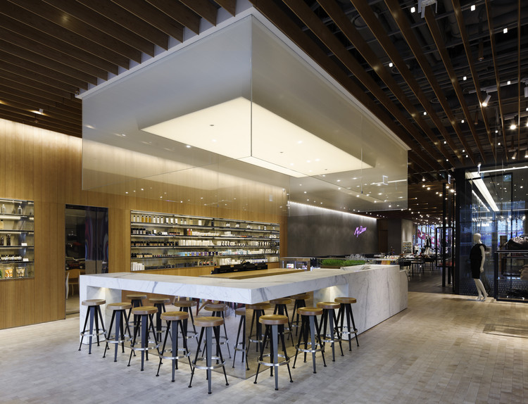
The scheme is divided into three zones; a large retail space for fashion, apparel and footwear; a juice bar and café; and a retail gallery of personal accessories and objects that acts as a connector between the two spaces. The design defines each of these zones through subtle shifts in materiality and color. The project employs unifying elements to tie the spaces together. Wood end-grain flooring is used throughout, with changes in color at each zone: natural finish at the north sales area, black at the retail gallery and white stained finish at the café. To reinforce a visual connection between the three zones, a louvered ceiling of natural wood runs the length of the space. Throughout all three zones, polished, stainless-steel shelving details add a consistent element to hand-troweled concrete walls and reclaimed, rough-sawn wood. Black is used as a framing device in each space to reinforce the spare palette of light woods, troweled concrete, white carrera marble, and polished stainless steel.

Throughout the shop, careful attention was paid to curating merchandise within a mix of social spaces. In the retail area, concrete planks, which feel more industrial, are stacked across the sales floor to create an adjustable display space and impromptu seating areas. The cafe is the main social space of the store, where customers can recharge their bodies with a healthy menu of fresh juices and snacks. It is part apothecary, as well as a café, with a hygienic atmosphere. The café area features a counter-height bar of white marble and gradient white glass above that gives an ethereal lightness to the space. The design is an investigation of the artificial versus the natural – wood surfaces punctuated by rubber tabletops, blackened-steel display boxes and concrete planking. It is not so much materials in opposition, but, rather, all materials having a level of industrial refinement to create a sense of ambiguity and mystery.


